Flex属性的用法
关于对CSS3 Flex弹性盒模型的一篇简单学习教程。
Flex 属性的浏览器兼容性
Can I use result的支持情况
Flex 的用法(参看)
reference in flex course
Flex 的使用
使用Flex box
1234.flex {display: flex; /* inline-flex *//* more browser prefix your should add such as -moz, -webkit- and so on */}主轴跟副轴
(具体依据是flex-direction属性)main-axis and cross-axis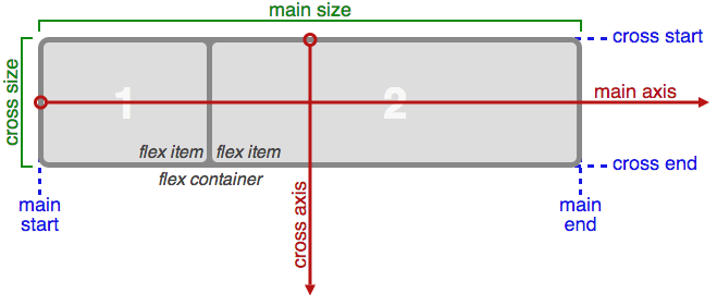
flex-direction 属性: 定义Flex盒模型子元素的方向

- row (defaults): 从左边到右边(默认)
- row-reverse: 与row相反
- column: 从上边到下边
- column-reverse: 与column相反123.flex-direction {flex-direction: row | row-reverse | column | cloumn-reverse}
justify-content 属性:
定义子元素的内容对齐方式(根据主轴方向),如果主轴有剩余空间
- flex-start 主轴开始方向
- flex-end 主轴结束方向
- center 始终居中
- space-between 子元素之间同等间距(同Flex容器没有间距)
- space-around 子元素之间同等间距且(同Flex容器有间距)123.flex {justify-content: flex-start | flex-end | center | space-between | space-around}
order 属性:
子元素之间的一些排序大小,order越大,次序越靠前(依据主轴方向)1234567.item1 {order: 2}.item2 {order: 1}/** 如果flex-direction为row,则item1子元素出现在item2子元素的左边 **/flex 属性
flex-grow, flex-shrink, flex-basis 属性的组合, 自动补全剩余空间1234567891011121314151617181920212223242526272829.flex {flex: 1 | auto}/** 示例 **/.container {width: 1000px;display: flex;flex-direction: row;}.container .item1 {width: 280px;}.container .item2 {flex: 1;}.contianer .itme3 {flex: 2;}/** 我们可以计算出 item1, item2 的宽度 **//** 剩余空间: 1000 - 280 = 720 **//** 基数: 3 **//** item1 占宽 1/3 * 720 = 240 **//** item2 占宽 2/3 * 720 = 480 **/flex-wrap 属性

定义当子元素超出父容器时是否自动另起一行123.flex-wrap {flex-wrap: no-wrap | wrap | wrap-reverse}
- align-conten 属性
如果副轴有空余, 定义内容的对齐方式,类似justify-content属性
- align-items 属性
定义子元素在副轴上的对齐方式
- flex-start: 副轴开始(取决于主轴)
- flex-end: 副轴介绍
- center: 居中对齐
- baseline: 与字体的baseline平齐
- stretch: 拉伸至Flex容器高度1234.flex {display: flex;align-items: flex-start | flex-end | center | baseline | stretch ;}